Path@Penn Redesign
This project asked students to reimagine the course registration process and website used at the university. Students were asked to conduct user research through their peers to identify major pain points within the registration process and use those insights to propose a revised website for the university.
User Research
Insight Statements:
Path@Penn provides many functions that users never access.
Students heavily value the opinions of previous students enrolled in the courses they are considering.
The landing page is rarely used, but users still complain about the layout.
The tab system has many shortcomings that slow down users.
The calendar function is valuable but is confusing to users.
How Might We Statements
How might we streamline the navigation of course search.
How might we make searching for courses more intuitive and quicker for users.
How might we provide students the information they value when considering a course.
How might we make the landing page highlight the primary functions while still allowing easy access to less frequented tabs.
How might we reduce extra work for user by providing the functions they want.
Wireframes
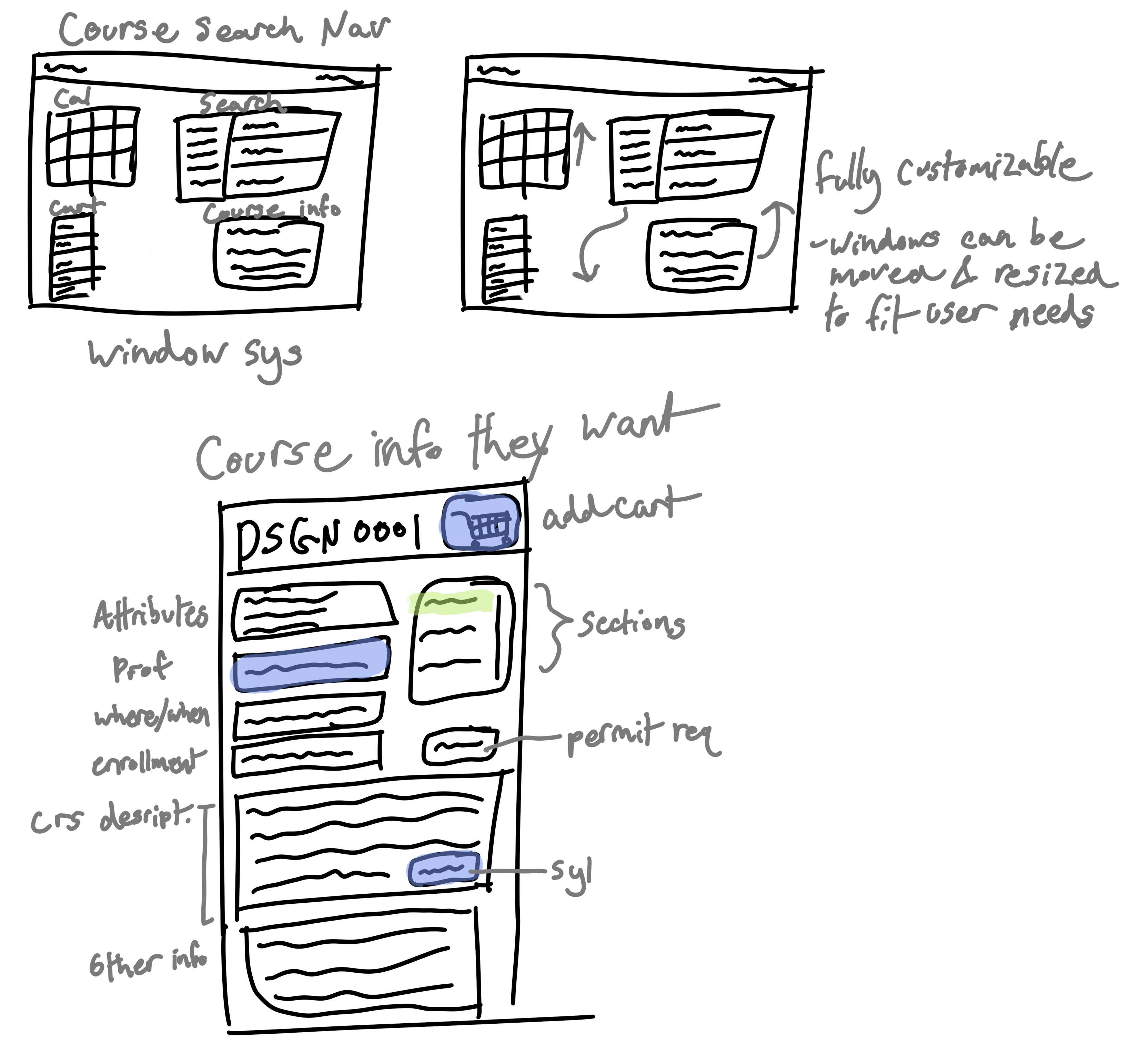
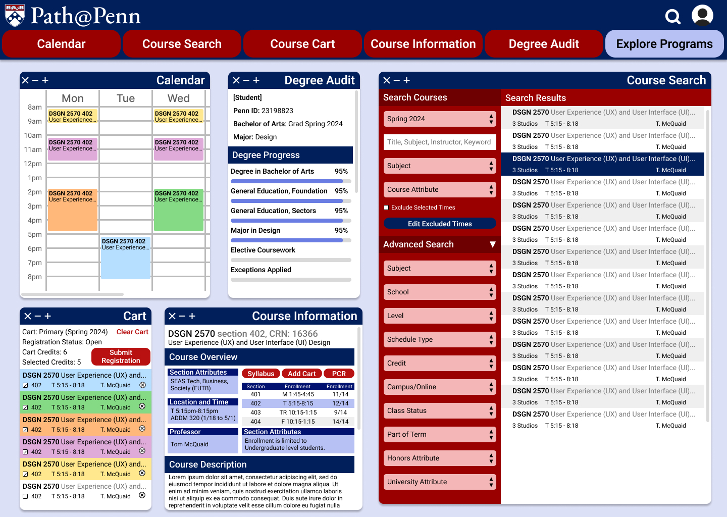
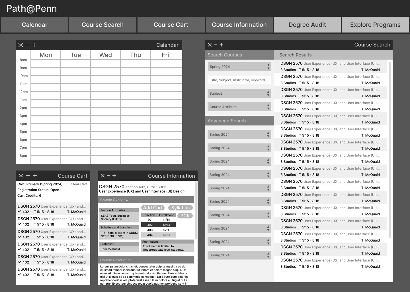
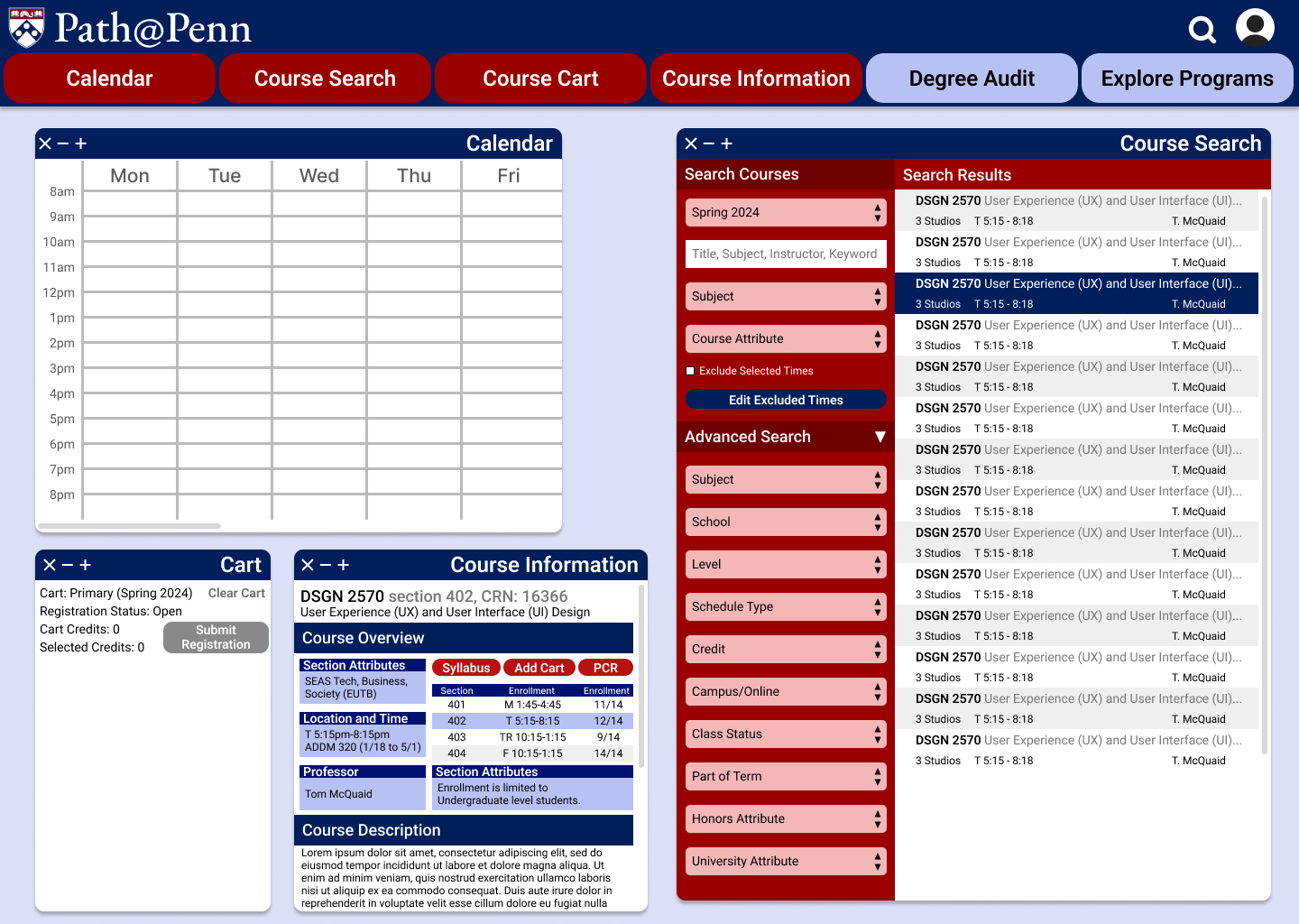
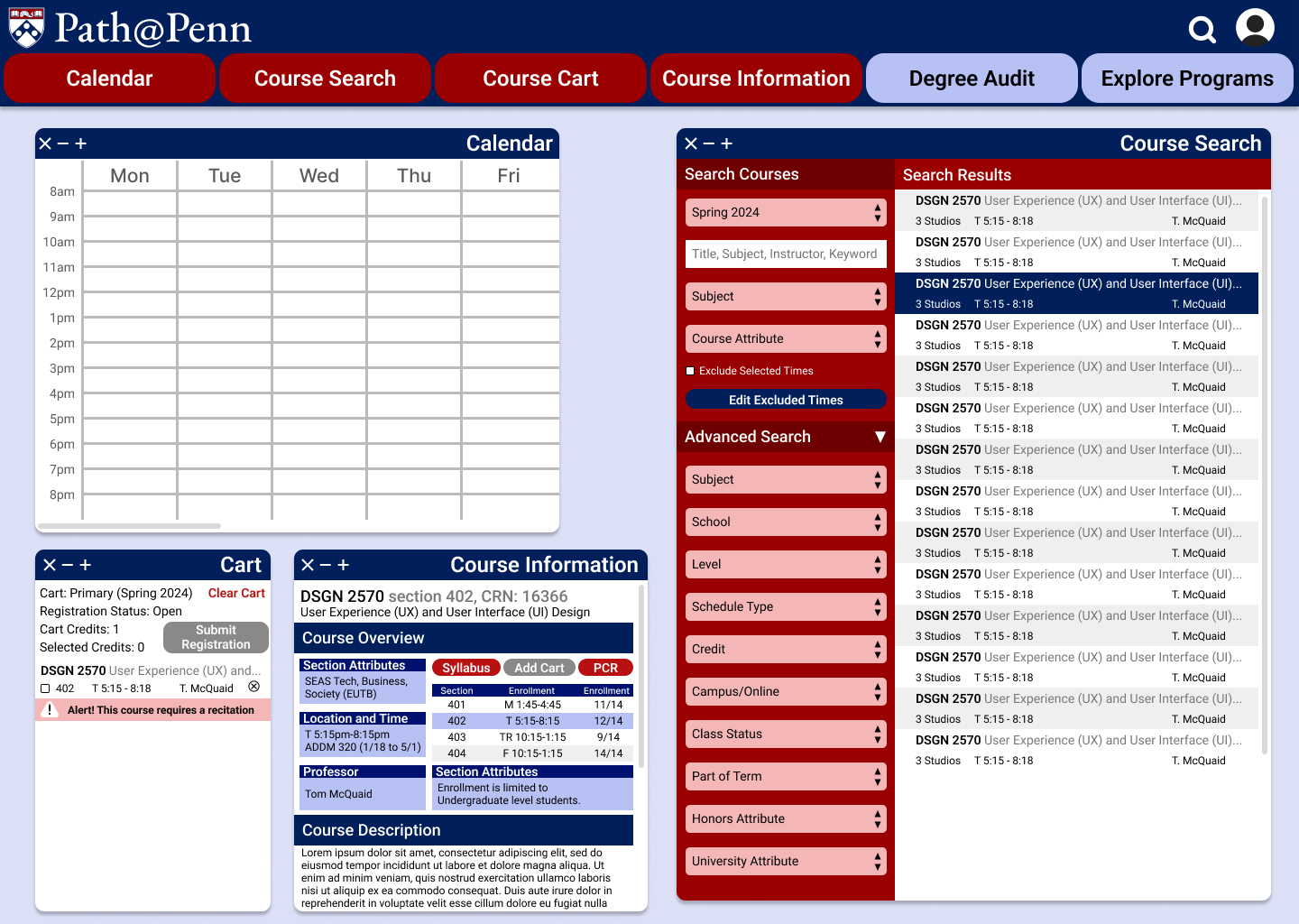
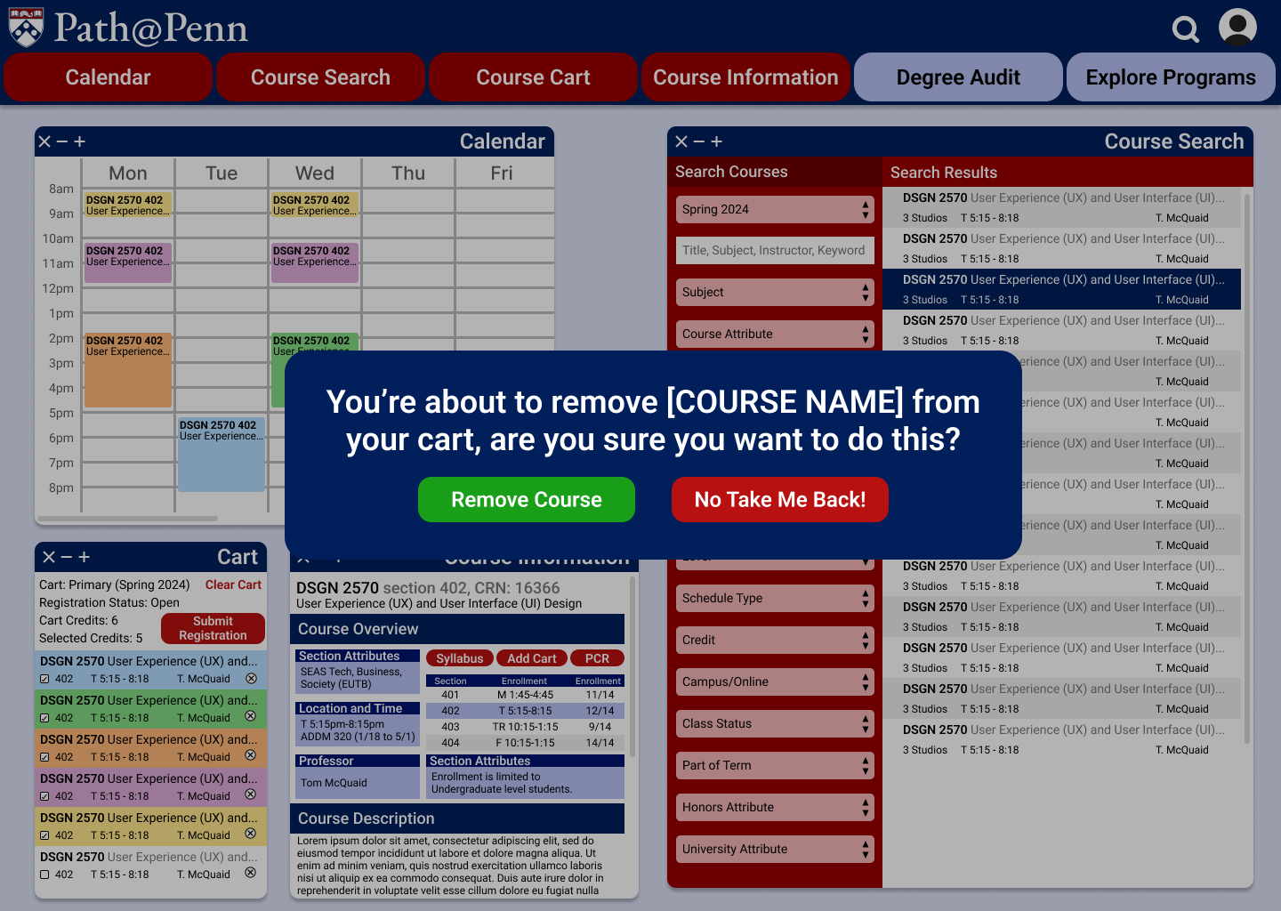
This sketch was the core of my design and revolved around redesigning the expanding tab system currently used by the universities website. This tab system required users to navigate through a series of expanding windows that could not easily be returned to since returning to an earlier tab closed all expanisions. A major issue students were encountering was difficulty comparing courses since course information could not easily be swapped between. The solution I propose was switching to a moveable window system that allows users to have multiple windows open of only the information they deem important. This would allow users to control what information is most prominetn when conducting their course search.
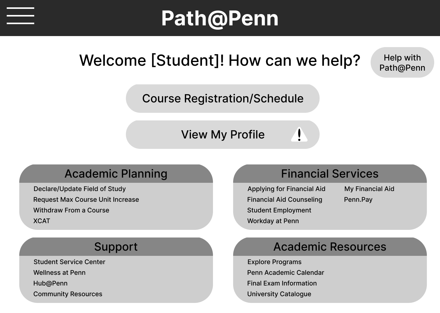
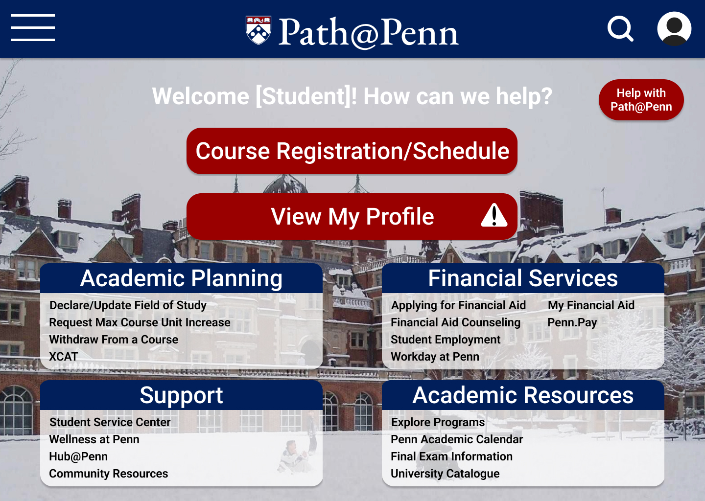
Homepage


Course Search
Course View
![]()
![]()
![]()
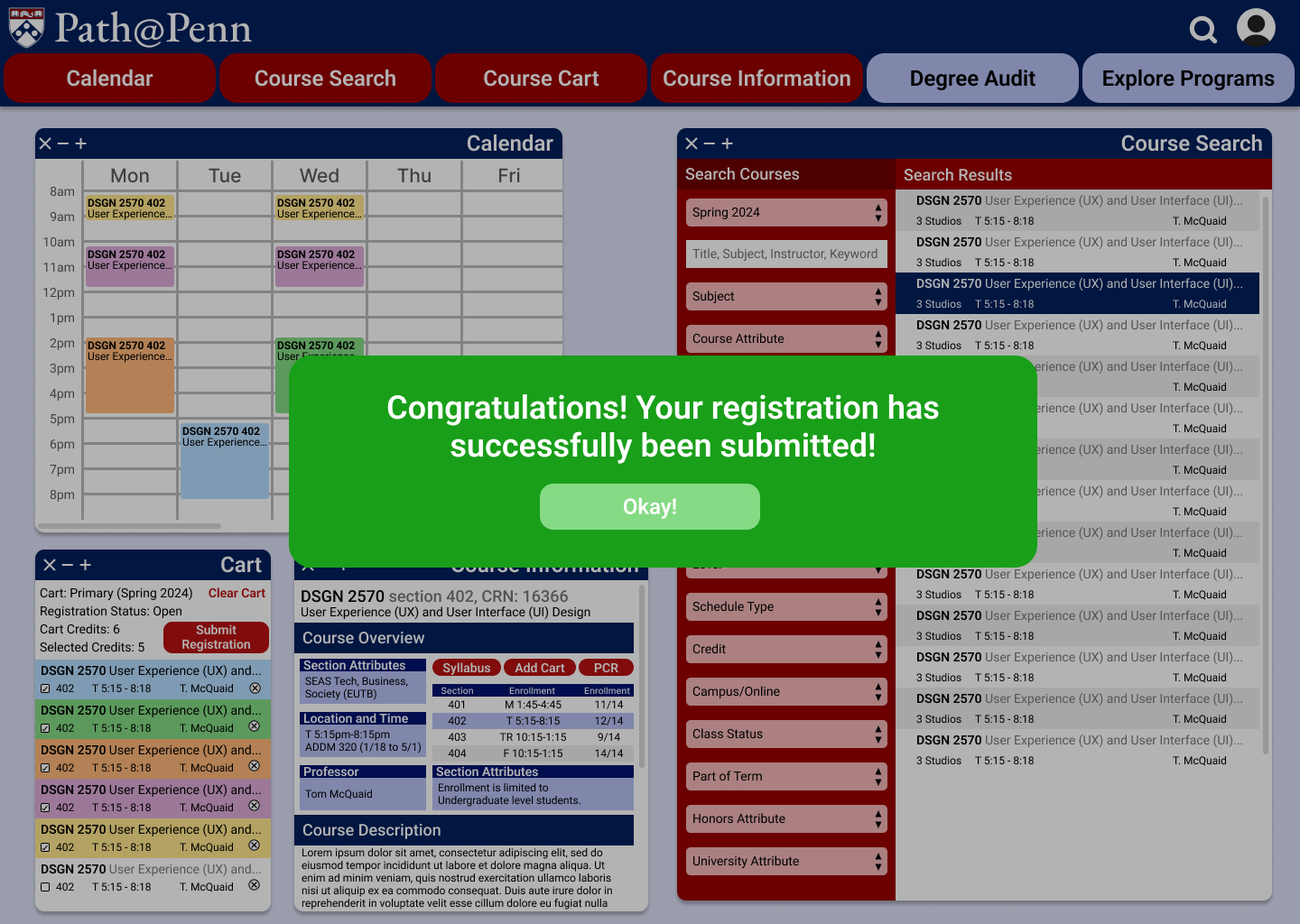
Confirmation Screens
![]()
![]()
![]()
![]()


Final Schedule View
![]()
![]()