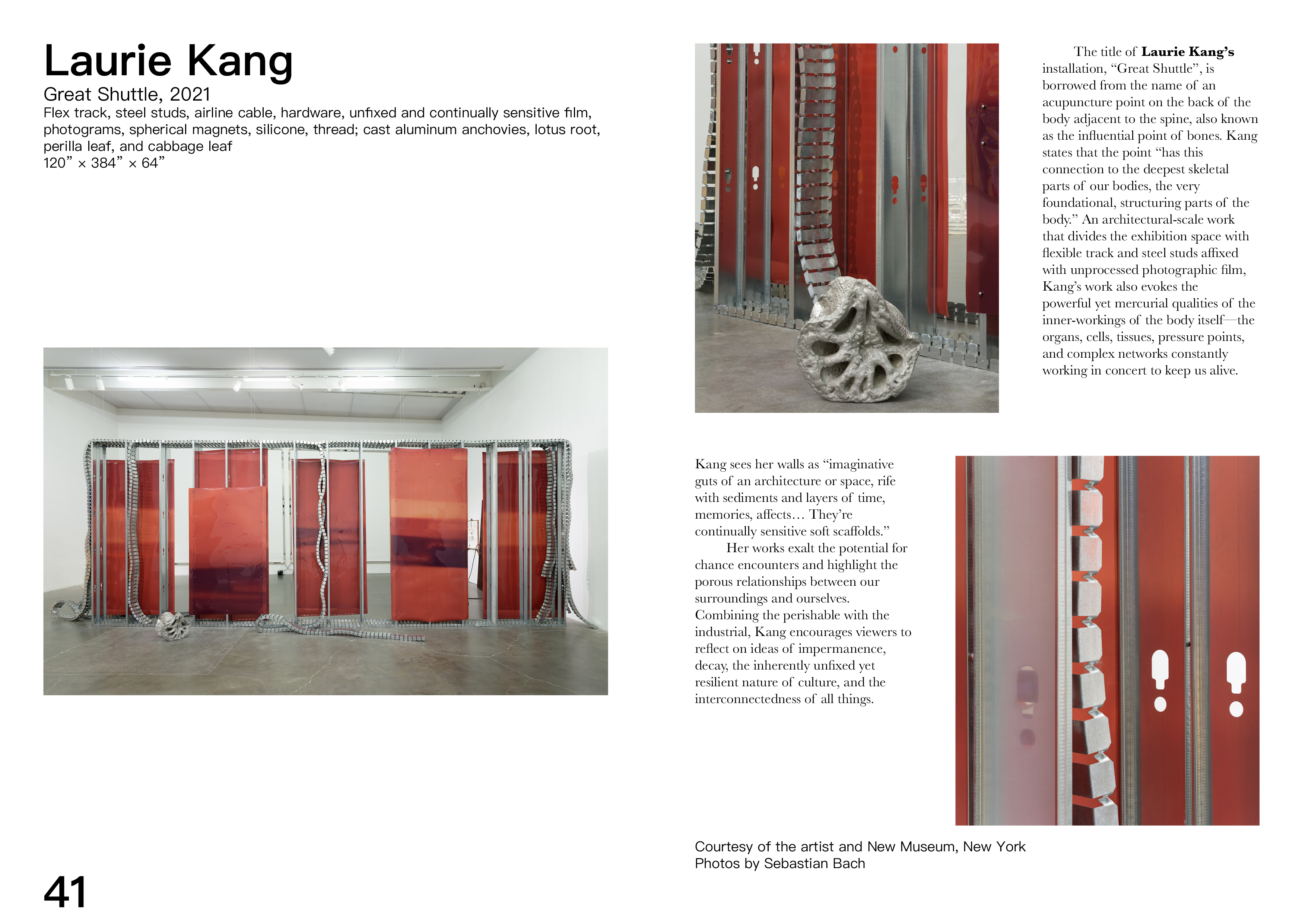
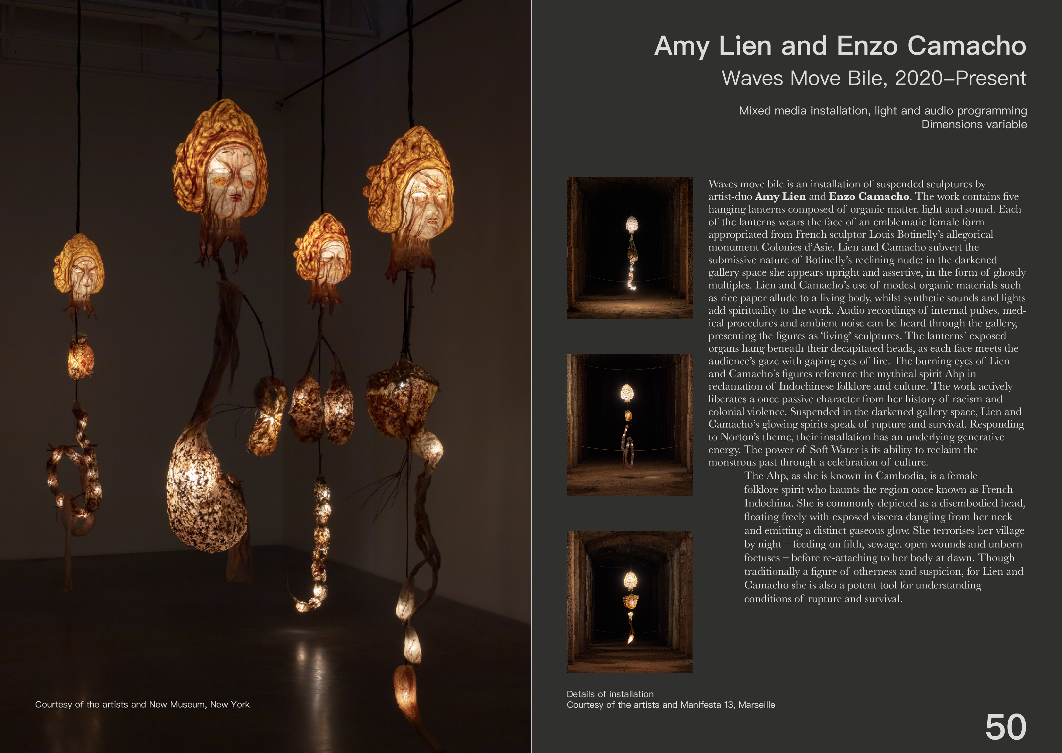
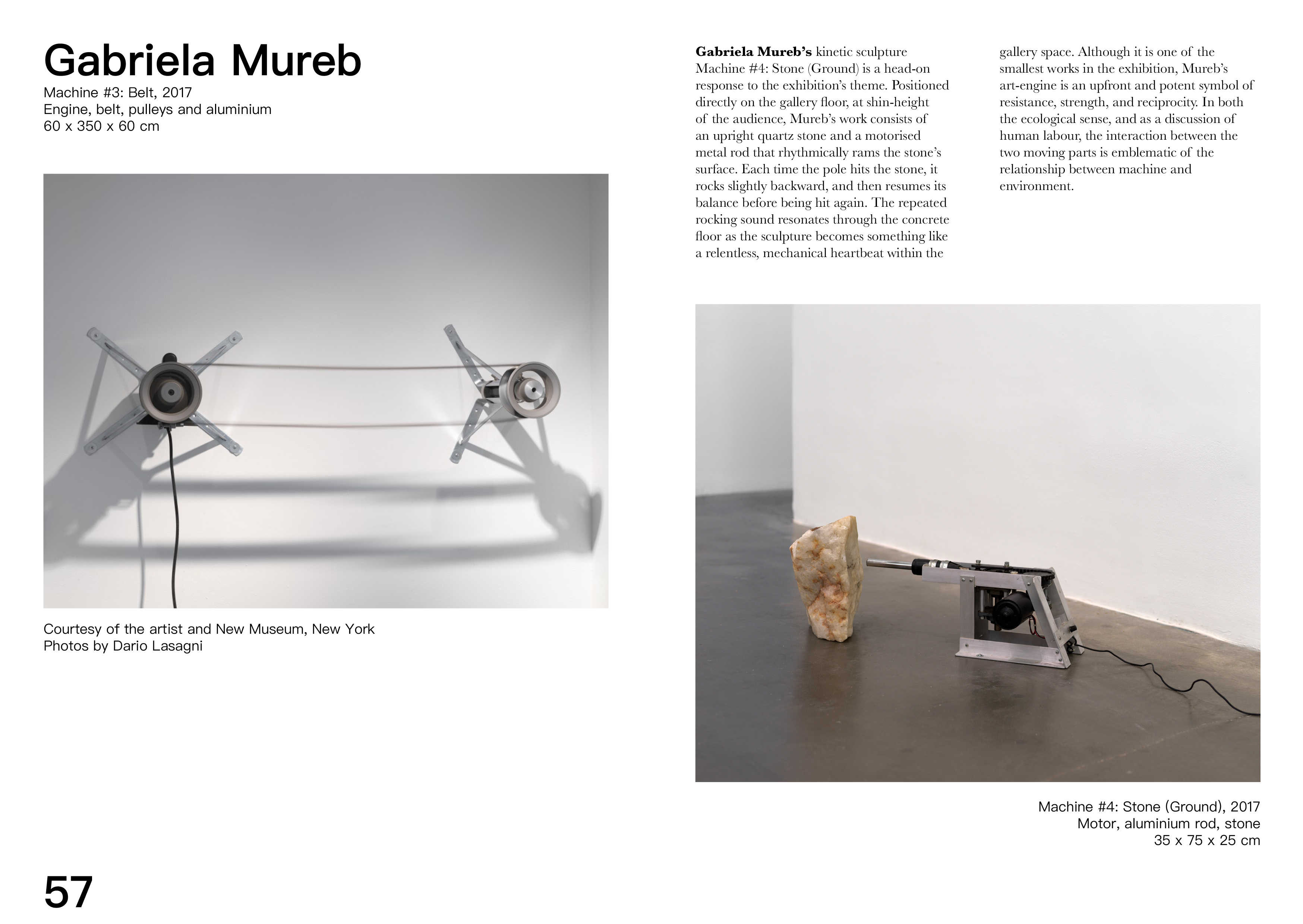
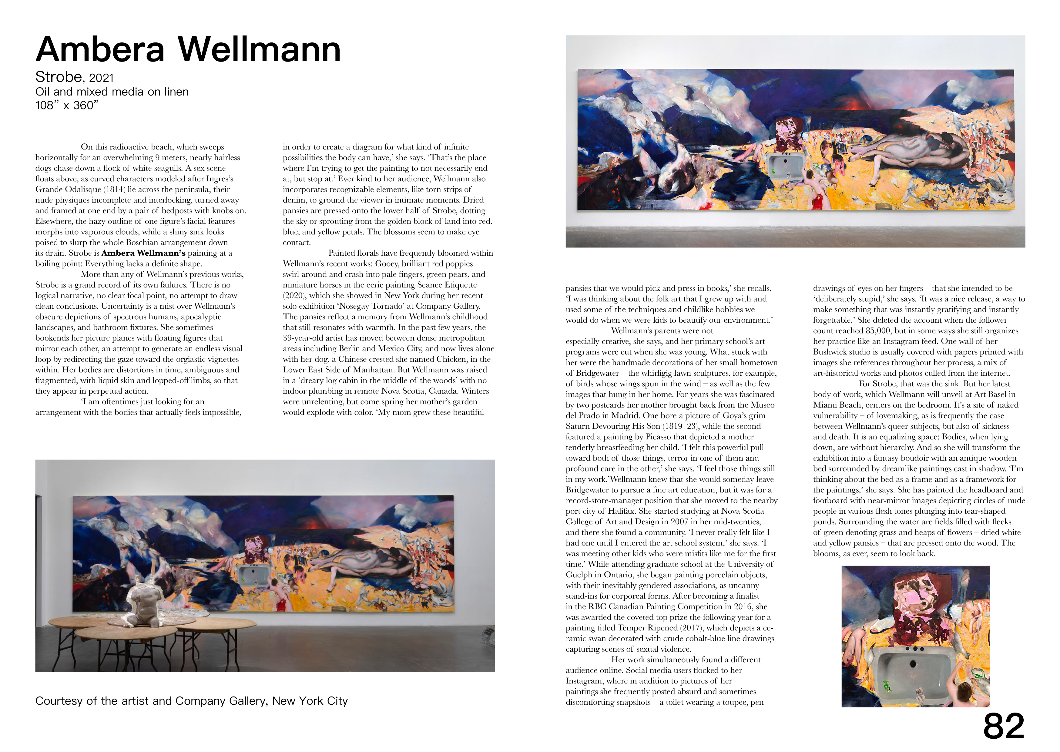
Soft Water Hard Stone
This project was for a graphic design class where students spent the semester working on a rebrand for an art show of our choice. I chose the 2021 New Museum Triennial Soft Water Hard Stone, which focused on the effect human persistence can have on a large problem during the recent pandemic.
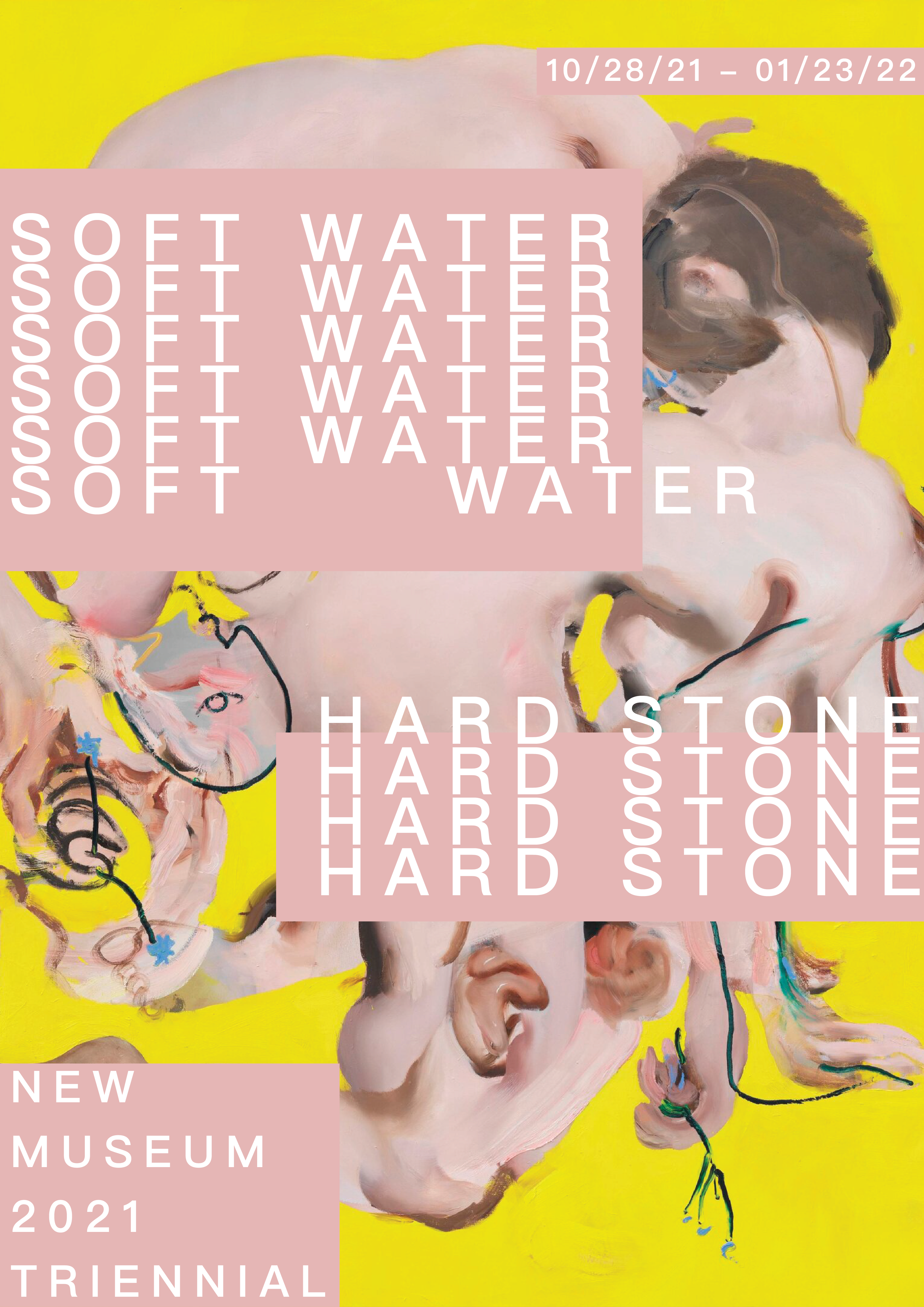
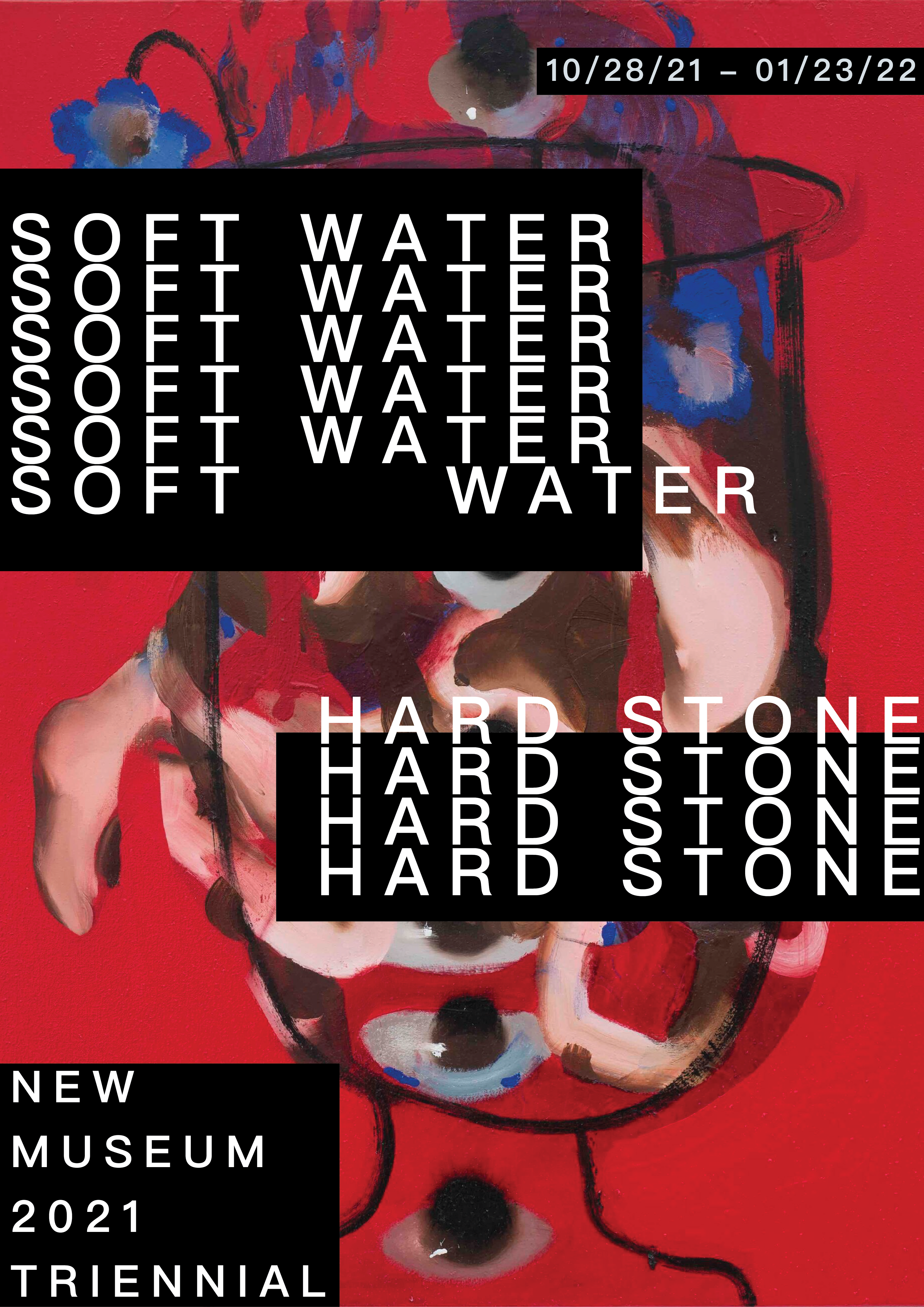
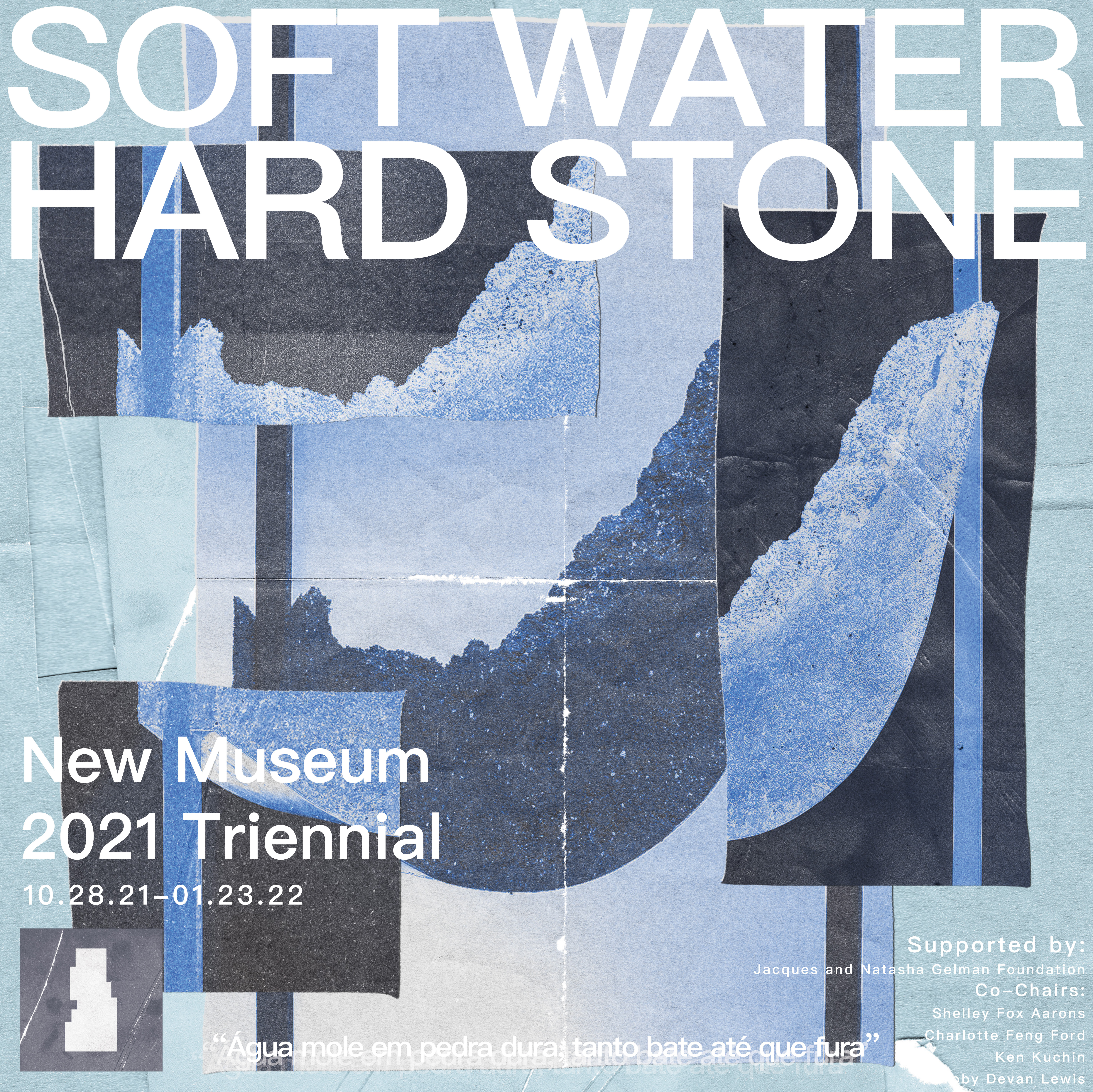
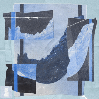
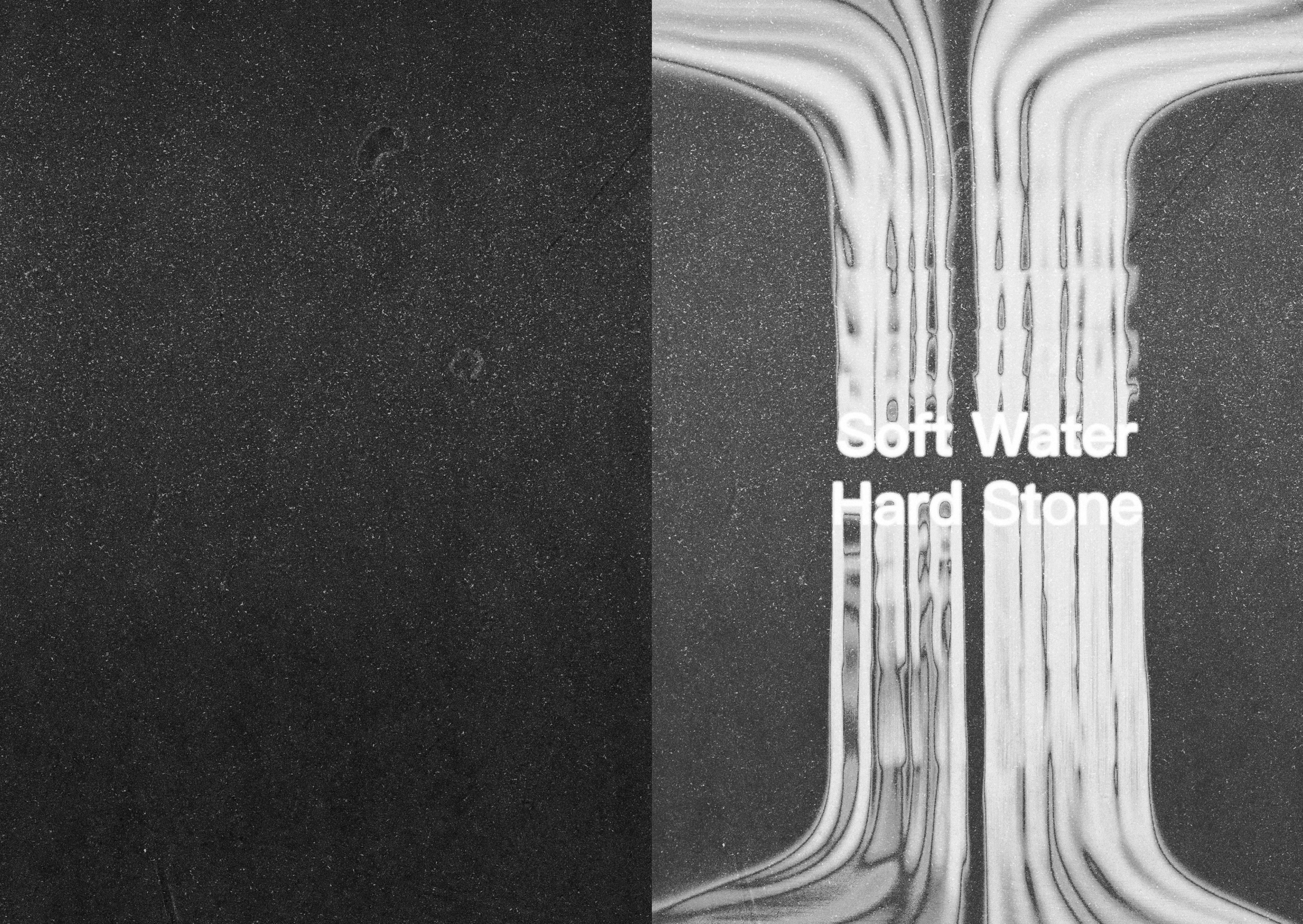
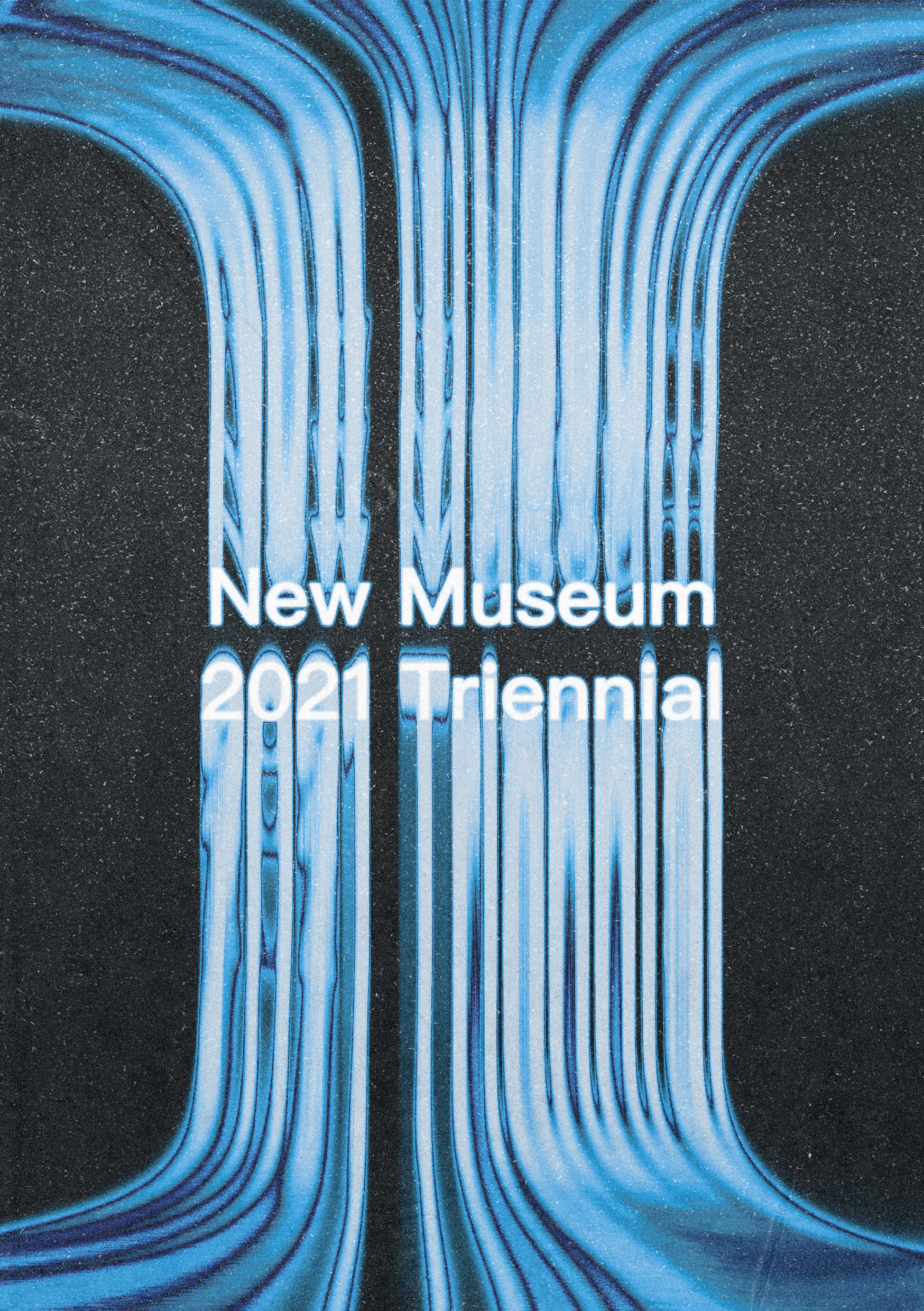
The poster project was supposed to help students find their theme for the rest of the semester. By making a handful of posters in dIfferent themes, the goal was to have students explore a diverse group of aesthetics to continue working with for the rest of the semester. My initial poster iterations were made in illustrator and were relatively simple, utilizing unedited versions of works featured in the show. I eventually decided to stray further from the minimalist designs the show already employed and explore texturing and color manipulation in Photoshop to make a ripped paper scrapbook theme. I wanted to make a poster that represented the theme of progress and degradation over time that the show was curated around. I thought that fragmenting an image of an artwork could represent both the ideas of construction and breakdown that the show’s artists grapple with. I combined this texture with blue gradient mapping to stick with the theme of life being fluid like water that the shows pieces comment on.
Posters Prototypes
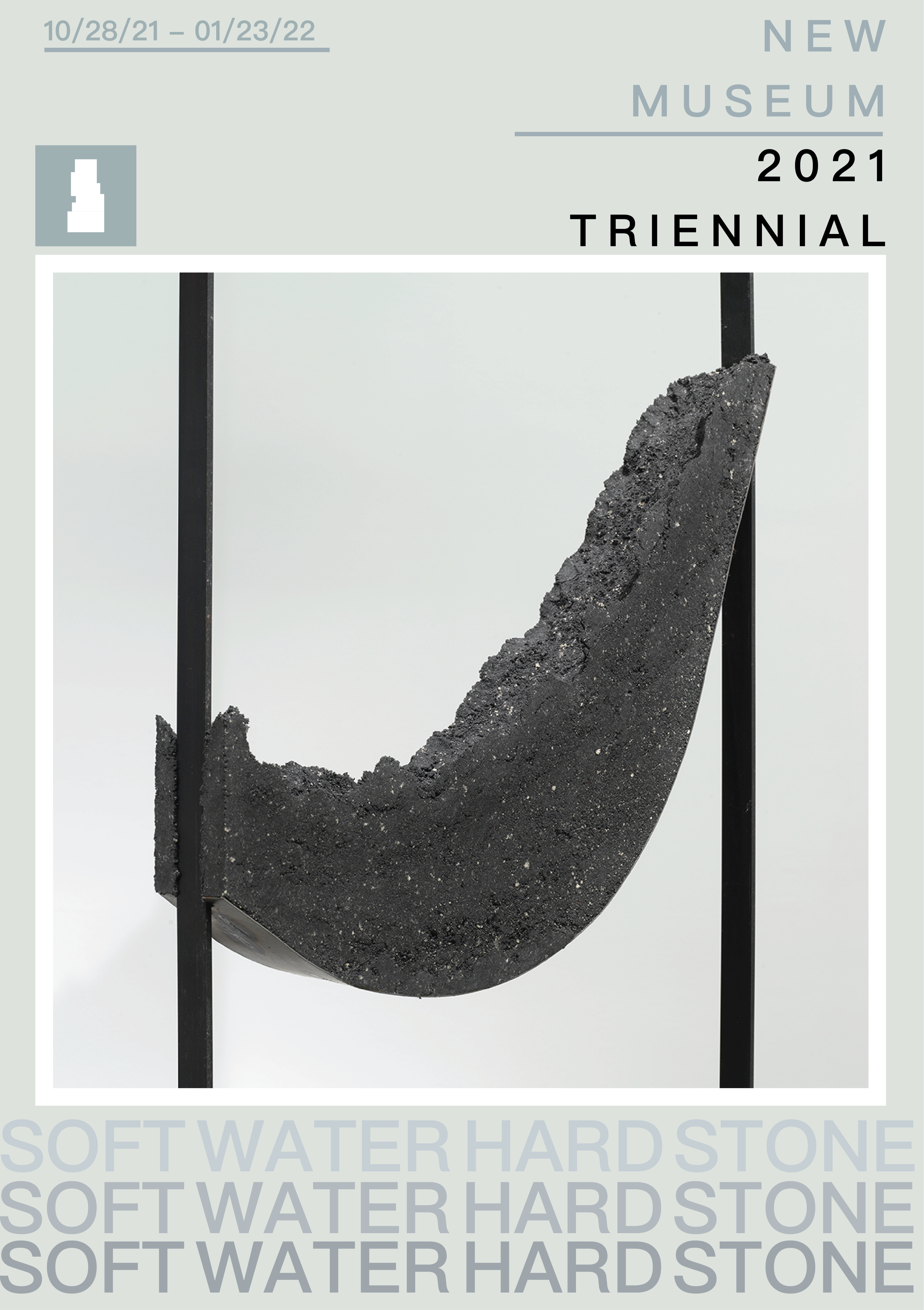
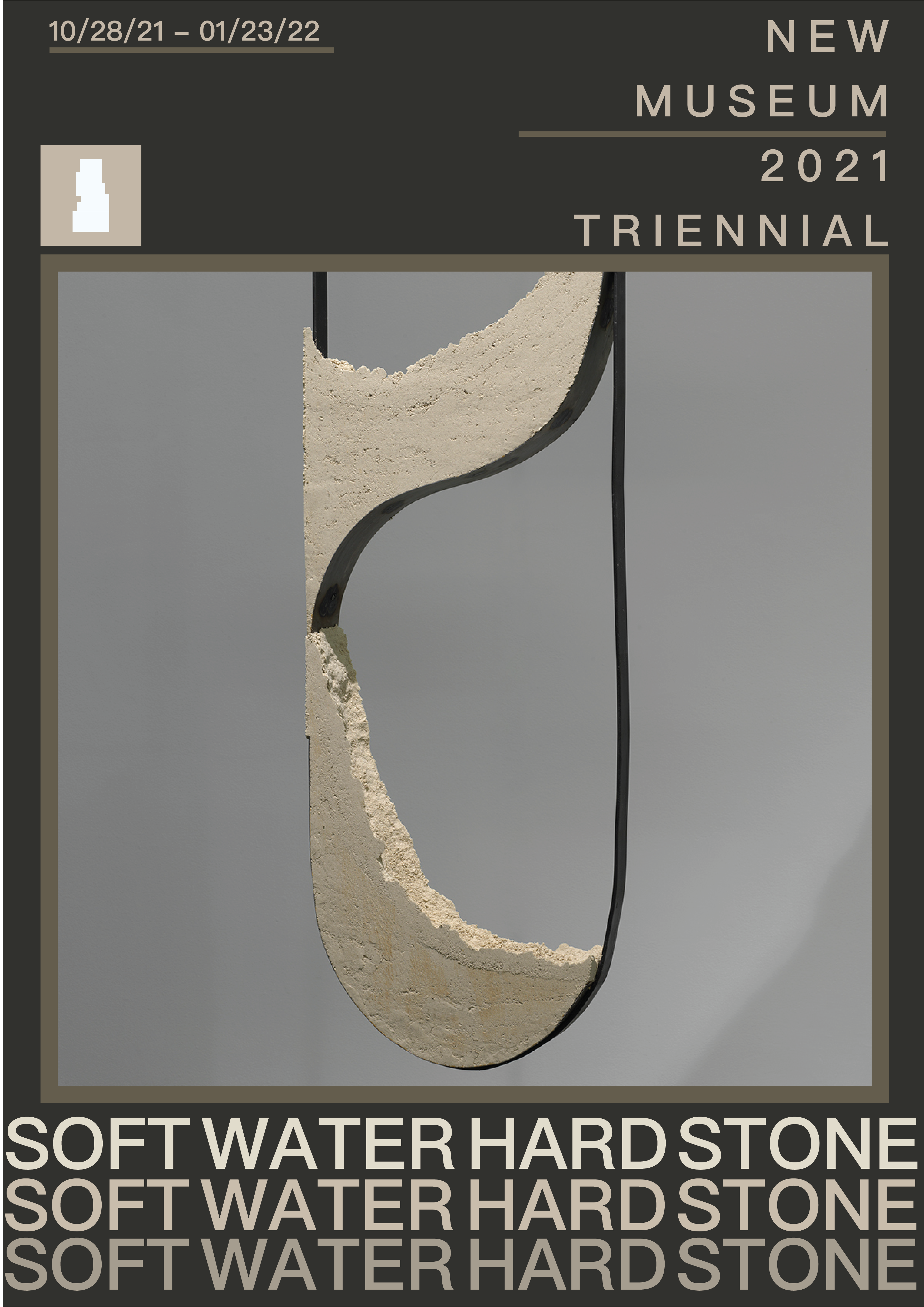
Final Poster
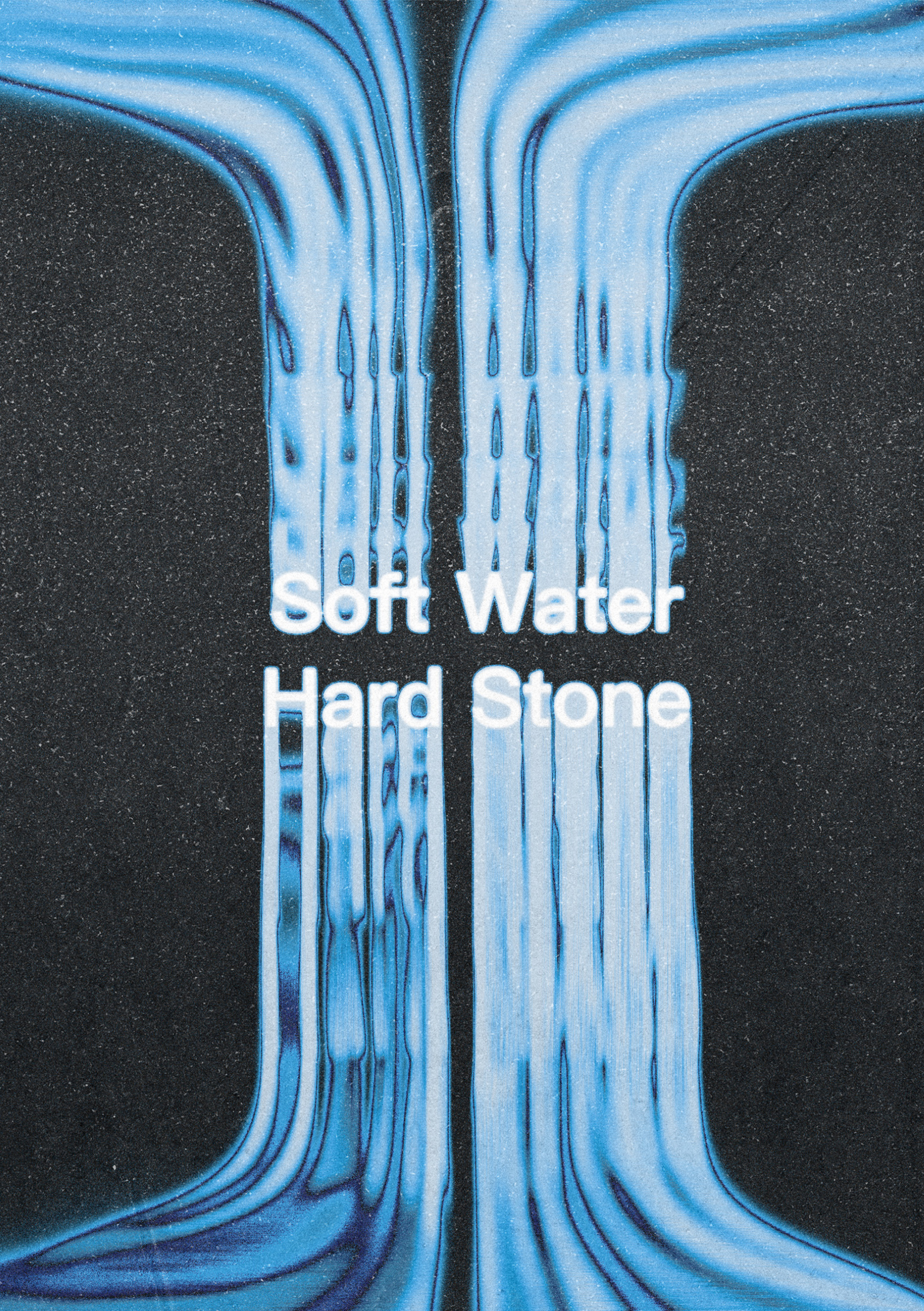
The next assignment for the class tasked students to make an animated version of the final poster for advertising. Using AfterEffects, I chose to make an instagram ad since my poster was already square and would translate well to the phone format. Drawing inspiration from the show’s message that everything is always in a state of change, I chose to make the background a flip book effect with various cutouts. I also wanted the text flicker on and off like old lights because it had a worn down look that embodied many of the pieces shown.
Animated Poster
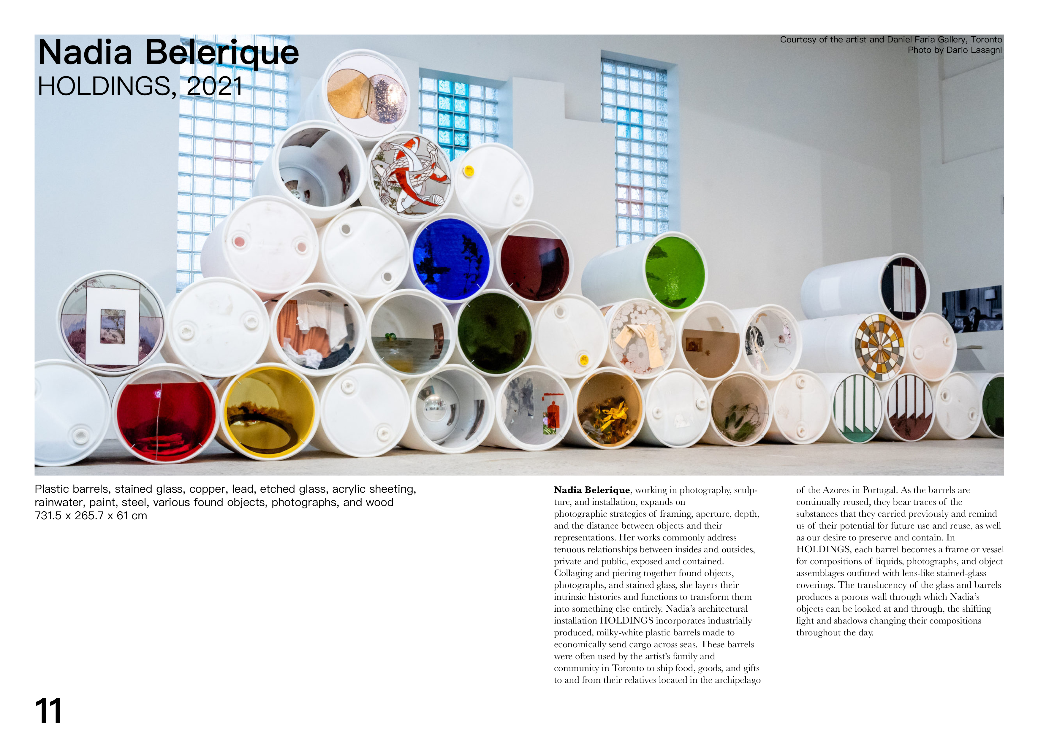
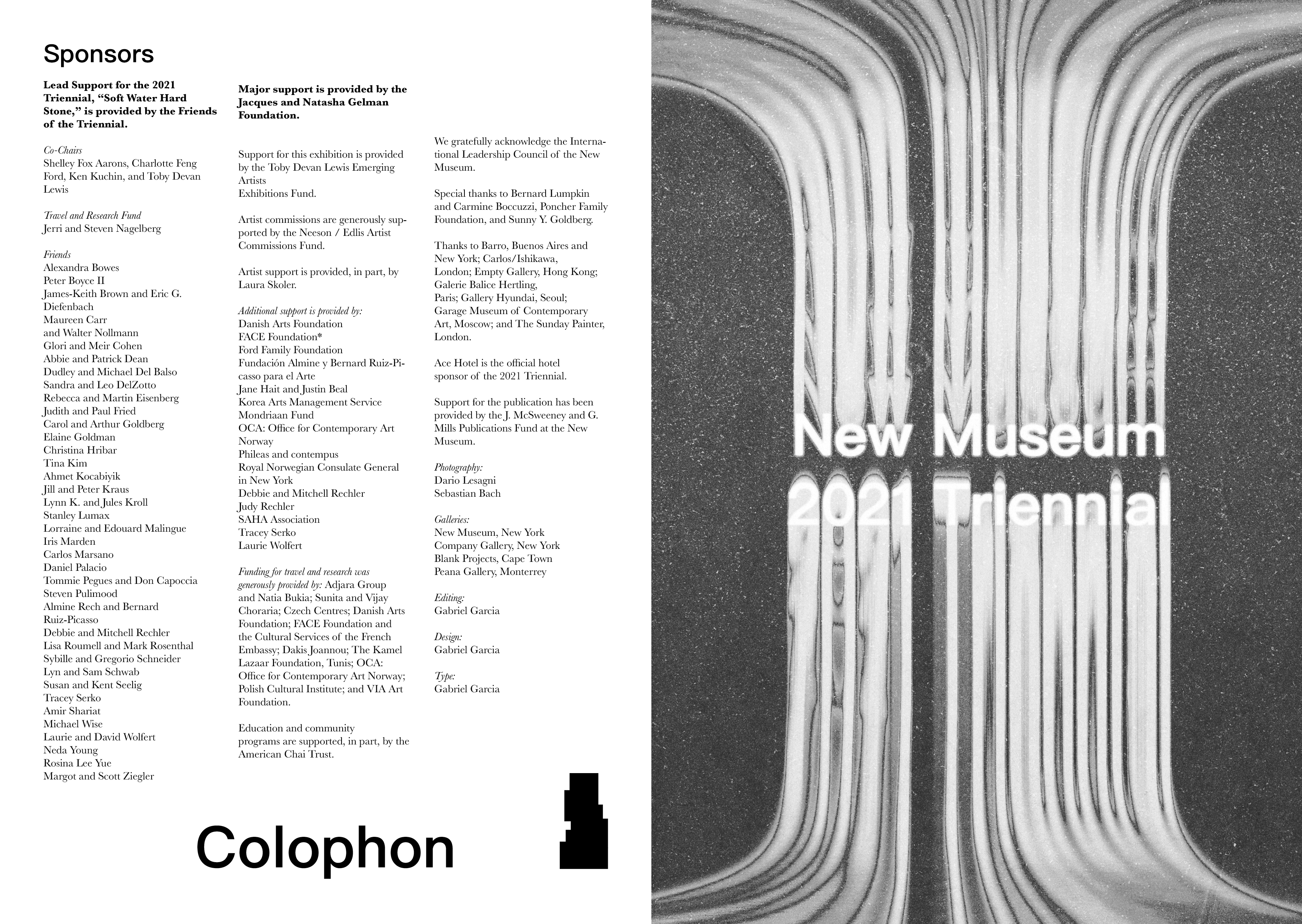
The third project was to make a mock publication for the show using InDesign. We were asked to make a publication that featured our favorite pieces from the show. For this assignment I had to veer slightly from my paper cutout theme I had been following up until now because it was becoming too complicated and confusing to theme each page. I instead opted to stick to that design language for only the cover and table of contents, the rest of the book employed a more simple and clean look akin to my earlier designs since it was clearer for readers.
Publication


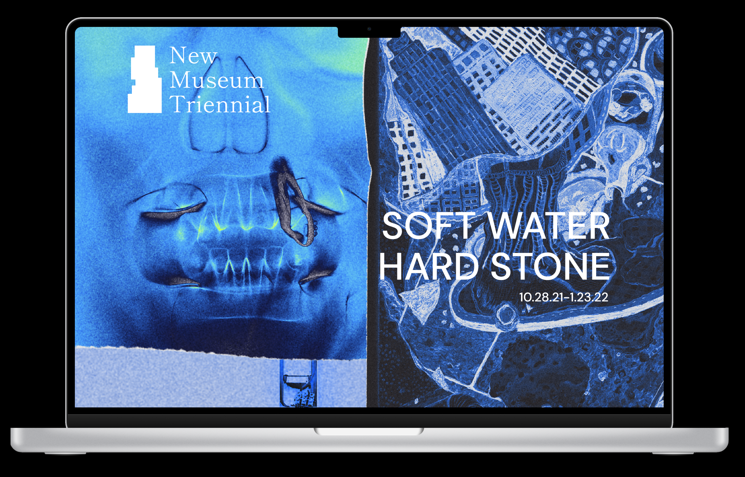
The final project was to make prototype website for the show that followed the theme we had been cultivating throughout the semester. I used Figma to make a basic UI for a website that shared all the information about the show and the projects I had done for the show as well information regarding sponsors and artists. The background for the website is a scrapbook like collage of my favorite pieces from the show that are edited in the same blue gradient mapping to match the initial poster.
Website Prototype